Crafting a design system
One of the topics I’ve explored with my team at work recently is design systems. When applied to web sites and mobile apps, this refers to the collection of basic components that we use to quickly and efficiently build up user interfaces. Generally at Blizzard, design is a long, bespoke process where each site or app is painstakingly crafted by hand for a particular purpose, usually to match the look and feel of one of our game franchises.
At a team level, we’ve used design systems to help rapidly develop web sites within a particular vertical. This is easily apparent in the set of corporate-themed sites that were released over the past year-and-a-half. While each site is visually distinct, if you break it down into its component parts, you’ll easily find that they’re all constructed with similar building blocks.

With the need for new web sites and other products rapidly accelerating, we learned that we need to take this idea to the next level. Currently we’re researching into ways to make a flexible design system that can serve more than one brand at a time. To that end, I decided it would be good to try it out on a smaller scale so I could learn more about the work my team is doing. This also gave me an excuse to dust off the Design Systems book I’d bought a while back.
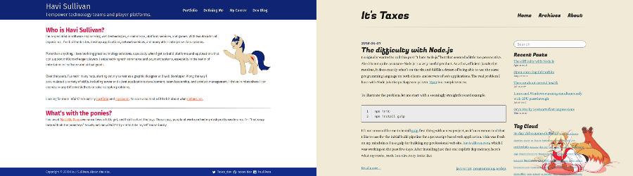
I started with the idea that I would unify both my professional site and this blog under one design system, despite the fact that they have two completely different visual styles. I call my creation the “Taxes Design System” (very original): https://github.com/taxes-dev/taxes-ds
The project is just a simple Node-based web site which houses the example components and SASS-based stylesheets. On its own, the example looks like this:

Click to see the whole example site.
I started with the basic components, including typography, links, and a simple grid system. After that, I modeled components after features that were already present on my professional pages such as cards and tabs. Since the blog’s layout is much simpler, this would end up covering use cases for both sites. Structurally, everything would be shared between both sites, but obviously the two sites do not share a similar look and feel. Thus, there are a plethora of SASS variables that control the perceptual design of the system. The base system uses a very basic theme that makes it easy to see the underlying structures, but once you see it in action on each site, you get a result that seems like they are not actually made using the same building blocks.
In the past, I had used off-the-shelf design systems like Bootstrap or Materialize to get started on rapidly designing my web sites. With this new system, I felt a newfound sense of freedom as I could build up from a base rather than strip away the things I didn’t want. These kinds of libraries can be helpful, but I found I was frequently fighting against them rather than working with them, and it was often difficult to pull out just the things I wanted. They frequently are meant to be a “one size fits all” affair, which means you end up with a lot of code and styling that you might not even be using. In fact, part of the impetus for doing this whole project was also the fact that I couldn’t upgrade Materialize on my professional site—the library had changed so much in the latest version that I would have had to rewrite significant portions of the site anyways.
Of course, the level of detail we’re looking at in the project at Blizzard is far beyond just a few simple styles and markup. We’re researching the possibilities with React and styled-jsx among other things, as well as how to share those components between a web site and a mobile app using React Native. (Speaking of which, reactive design is a whole other topic I’d like to talk about some point.) But this gave me a good taste of what can be done with highly composable, flexible components when building front-end UI.
In the end, it really made sense to me as an engineer since composition and reusability are fundamentals I learned in object-oriented programming. The challenge is trying to think about it in such a way that allows for the rapid reuse of visual components without sacrificing the feel of handcrafted perceptual design. The last thing you want is for all your carefully built sites and apps to look like they were generated from a tool.